Following the feedback from the crit and during the sketching out of further logo ideas I have decided to go with the name 'Flashback' this was something that was mentioned as a favourite in my feedback. But they also liked the use of the rewind icon being associated because of its link to old style TV and video that was in the 80s but also the idea of travelling backwards in time. Throughout my sketches I tried to incorporate the rewind icon into my design as it still related to flashback. I found that it may look good to replace the 'a' with as there is also ideally two in the word. This could then be shortened as a notable icon that related to the full brand word clearly still.
Another suggestion from the crit was to use a typeface that was more 80s in its appearance and enhance this visual further with possibly notable colours of the 80s such as neons. They suggested to look at the Drive film posters for inspiration.

This poster used a script appearance to the type but I didn't think this would be suitable on screen in a small size as too much legibility would be lost. So instead I have gone for an italic brush stroke which works similarly on a visual sense but can be read with much more ease at smaller scale- ideal for use top corner of TV screen. It also allowed for contrast between the symbol and the word so the two elements could be distinguishable from one another but still read and be understood.


I had some issue with the icon appearing central inside a shape. Although above doesn't appear to be central on the actual document alignment it was. So to avoid this I used the icon alone. This worked better visually as it was much stronger but also linked better to the whole word as this is how they appeared when representing the letter 'a'. More recognisable to the audience its reference. Thicker line weight also worked better within the word as it balanced out the strength of the stroke on the font.


I have tried various neon colours to reflect the style of the decade and feel it is on the right direction it is now about choosing the most suitable one that would work across a range of different backgrounds and be unisex.
I have also decided to slant the rewind icon for the use as the letter 'a' so that it matched the italics of the word. All the elements being at the same angle makes it more fluid as a shape- blend together better. These slanted shapes were then used for the rewind icon to continue the visual throughout.


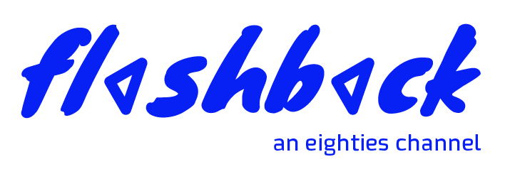

Above is the final concept for the brand logo that I have finally settled on now which I am pleased with as it has come along way since my initial sketched ideas and shows what I was aiming for from the beginning but I am going to get further feedback before developing the brand identity any further.
No comments:
Post a Comment