The existing logo inspiration which I have looked at focuses on hand drawn script typography which I feel is the most appropriate way forward when initially thinking about the new sound and style of the band. Their transformed style is very floaty and girly and I feel that these logos are also inspired by similar thoughts because of their fluidity to form. Each of the examples picked also have reference to flowers which is perfect to link back to the lyrics of the songs I am working with. I have noticed that when working with a hand drawn aesthetic or script font each logo uses some form of circular structure to base the form around as a way of enclosing the design but also to work with the smooth flowing lines of the typeface chosen. The use of a structure to contain the text within is definitely something I will look into further with my own design as I feel it could work well when trying to place the logo onto the circular format of the CD or over detailed cover illustrations. By containing in one area/shape this would hopefully make the logo more legible over the other details of the design.


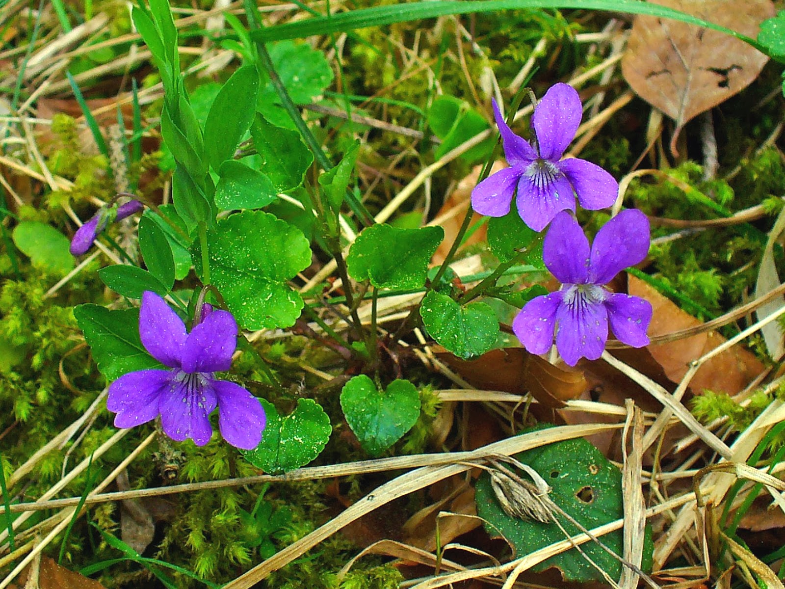
I looked at the actual violet flower as this was directly referenced in the bands name and also links well to their lyrics and their new style/ethics. The colour is the most striking part about the actual flower and is something that I will take as the overall colour for the band just because it ties in with the other links strongly. The flowers themselves are small in size and simple in their form and because of this and the difficulty to get hold of them at this time of year I will use other related garden flowers to base my actual visuals on. I want to use flowers that have more visual details and that are more complex in form so that the cover patterns are stronger and more detailed to mimic the lyrics of their new songs better.


No comments:
Post a Comment