From the sketches which I had drawn up I began to develop these digitally finding appropriate existing fonts that would work to create the visual desired in my initial ideas. This took a lot of different attempts at finding the correct script and headline font but eventually settled with ones which had quite a thick line weight to them so that they would stand out on the page without been too over the top. I also chose ones which had subtle details so that the design wouldn't feel too cluttered once I started to add a few illustrated letters and different alignments. Throughout the development I tried to add movements that would suggest the word or action in the lyric as intended from my ideas.
I attempted to make the letter 'G' appear as if it was hanging as the word suggest and it was something which I had sketched out in my ideas. I quickly realised though that digitally this would not work as legibility has been lost and it distracts from the flow of the line and lyric when read.
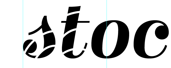
I also attempted a candy strip on the lettering to add to the appearance of Christmas and to add some subtle details to the typographic piece but again this did not work and reduced legibility.
Throughout this development I have tried various different ways to illustrate the letters so that they would mimic the lyric/word but found that the simpler visuals worked best as they kept legibility high without distorting the chosen fonts too much but still looked interesting enough. I also thought that as the scale that the design will be applied to will be quite small it would be better to keep decorative fuss to a minimum so that it could read and stand out.


No comments:
Post a Comment