The development process was relatively easy because I had a strong idea of what the layout should be like, following primary research of existing posters. Another reason for development to be easy was that I already had the main display type created from the past brief with Mike. Because of time restrictions this brief has now become more of an expansion of the type brief to show its use in context but also a chance for me to explore and experiment with print formats.
During this process I experimented with a range of possible layouts of the type and content until I felt the aesthetics and balance of information was correct.


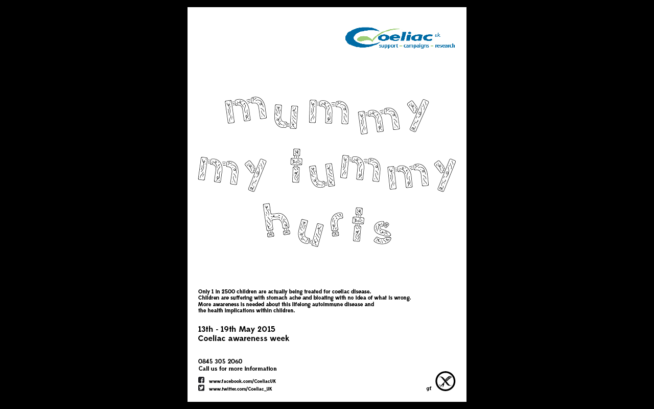
I made the choice to tilt and alter the alignment of the display type to suggest a stronger visual of a child and its influence on the poster. This allowed this concept and information about its purpose to be seen easier at distance which is good with the format being a larger scale poster.
I have also looked at printing on a variety of bright coloured stock. Although this didn't work as well as I had originally thought as legibility was lost because contrast wasn't high enough. Although the display type was now represented in context well it didn't have a strong reference to the concept and the idea of children. A way of improving this visual was to add a crayon approach to the illustration of the type. This would give the suggestion of child involvement but also an opportunity to include the bright colours explored through stock to brighten up the posters and cause audience engagement. This effect was easily achieved with the Wacom tablet and I was pleased with the final outcome.


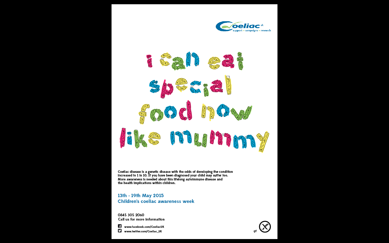
The final outcomes are appropriate for their use and engage well with the audience and subject matter. This engagement was developed further in the postcards which would use the same sayings without the crayon illustrations. Bright colours also work better to draw the eye in and also to the relevant hierachy of information too, with the importance of the dates and charity involved highlighted with colour. As the postcards are a handheld format it made sense to allow the audience to interact with them and use the type to colour in themselves re creating the visual of the posters. The formats chosen work well to show the typeface in context and work well to show off its chosen name of 'Involved' well because the audience can actually get involved with its visuals when outline version is used.
No comments:
Post a Comment